


We discussed about Seaborn and we discussed categories of it. We covered Visualizing statistical relationships now we’ll see Visualizing Categorical Data.
We have to understand that there are data which are not directly connected with each other but are having different categories. In last class we saw that the seaborn was having data named tips where we saw that how the amount of tip given and the bill was having relation that they were increasing linearly. That is not importantly case all the time.
Now we’ll see the relationship between two variables of which one would be categorical.
• There are several ways to visualize a relationship involving categorical data in seaborn.
• catplot() – it gives a unified approach to plot different kind of categorical plots in seaborn
catplot() Function
• Categorical scatterplots:
* stripplot() (with kind=”strip”; the default)
* swarmplot() (with kind=”swarm”)
• Categorical distribution plots:
* boxplot() (with kind=”box”)
* violinplot() (with kind=”violin”)
* boxenplot() (with kind=”boxen”)(We'll not learn boxen because it's very same to boxplot)
Categorical Scatter Plots
catplot() function is used to analyze the relationship between a numeric value and a categorical group of values together.
- Syntax: seaborn.catplot(x=value, y=value, data=data)
Categorical data is represented in x-axis and values correspond to them represented through y-axis (standard notation). We can reverse it.
The default representation of the data in catplot() uses a scatterplot (stripplot).
Categorical scatterplots:
- stripplot() (with kind=”strip”; the default)
- swarmplot() (with kind=”swarm”)
stripplot()
- A strip plot is a scatter plot where one of the variables is categorical.
- And for each category in the categorical variable, we see a scatter plot with
respect to the numeric column.
- Parameters –
- The first parameter is the categorical column, the second parameter is the numeric
column while the third parameter is the dataset.
- The jitter parameter controls the magnitude of jitter or disables it altogether. Jitter is the deviation from the true value.
In [ ]:
import seaborn as sns import pandas as pd import matplotlib.pyplot as plt sns.set()
In [ ]:
df = sns.load_dataset(‘tips’) df.head()
Out[ ]:
| total_bill | tip | sex | smoker | day | time | size | |
|---|---|---|---|---|---|---|---|
| 0 | 16.99 | 1.01 | Female | No | Sun | Dinner | 2 |
| 1 | 10.34 | 1.66 | Male | No | Sun | Dinner | 3 |
| 2 | 21.01 | 3.50 | Male | No | Sun | Dinner | 3 |
| 3 | 23.68 | 3.31 | Male | No | Sun | Dinner | 2 |
| 4 | 24.59 | 3.61 | Female | No | Sun | Dinner | 4 |
In [ ]:
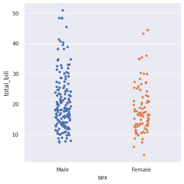
sns.catplot(x = ‘sex’, y = ‘total_bill’, data = df) plt.show() # Crack a joke that men eat more than women hence we can see more total bills in Male.

In [ ]:
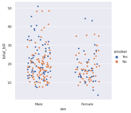
sns.catplot(x = ‘sex’, y = ‘total_bill’, data = df, jitter = 0.25, hue = ‘smoker’) # Jitter controls the randomness of data. By default it’s value is 1. plt.show()

In [ ]:
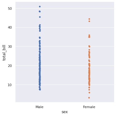
sns.catplot(x = ‘sex’, y = ‘total_bill’, data = df, jitter = 0.005) # If you’ll keep jitter at 0.005 it will appear in straight line and randomness will be removed. plt.show()
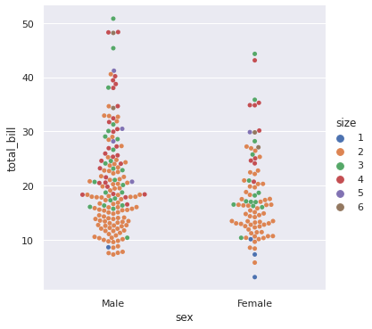
Swarmplot()
- Similar to stripplot, only difference is that it does not allow overlapping of
markers.
- It adjusts the points along the categorical axis using an algorithm that prevents
them from overlapping.
- It can give a better representation of the distribution of observations.
- Although it only works well for relatively small datasets. Because sometimes it takes a lot of computation to arrange large data sets such that they are not
overlapping.
In [ ]:
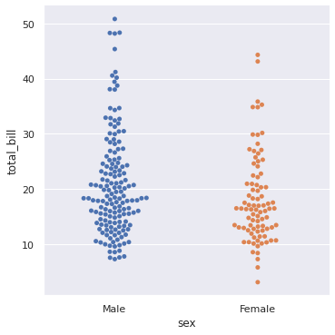
# The benefit from swarmplot is that we can see the magnitude of data at any point and they don’t overlap. sns.catplot(x = ‘sex’, y = ‘total_bill’, data = df, kind = ‘swarm’) plt.show() #The magnitude of total bil is highest for Male. The answer is at between 17-18.
In [ ]:
sns.catplot(x = ‘sex’, y = ‘total_bill’, data = df, kind = ‘swarm’, hue = ‘size’) plt.show() # Here we can see how many people went to eat together. Can you tell what is the count of no of groups which went to eat. The answer is 2.

Categorical Distribution Plots
Distribution Plots
- As the size of the dataset grows, categorical scatter plots become limited in the information they can provide about the distribution of values within each
category.
- In such cases we can use several approaches for summarizing the distributional
information in ways that facilitate easy comparisons across the category levels.
- We use distribution plots to get a sense for how the variables are distributed.
Categorical distribution plots:
- boxplot() (with kind=”box”)
- boxenplot() (with kind=”boxen”)
- violinplot() (with kind=”violin”)
Boxplot
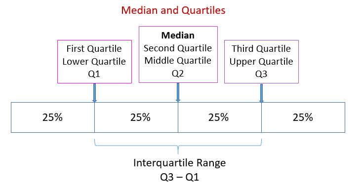
It is having concept of quartiles which basically means dividing the data in 4 parts who are scoring between 75-100 marks they’ll be in fourth quartile and so on. Generally what happens is that data is in 2nd or 3rd quartile that means in between.


Box Plot
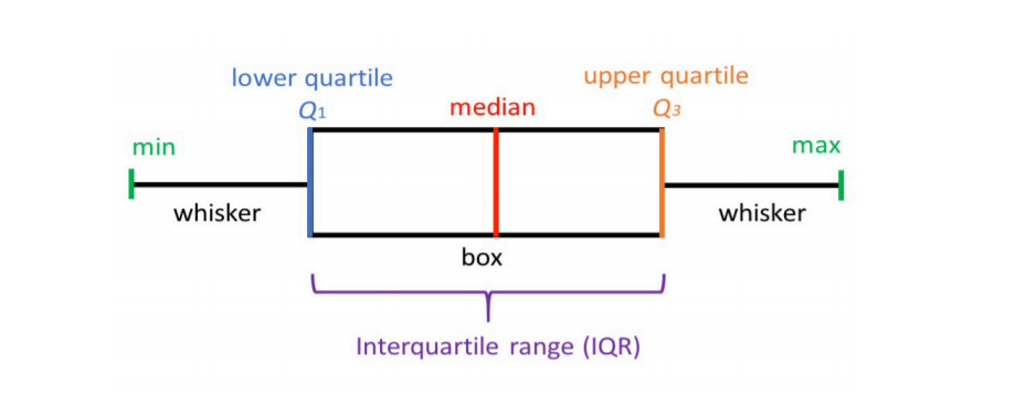
- It is also named a box-and-whisker plot.
- Boxplots are used to visualize distributions. This is very useful when we want
to compare data between two groups.
- Box Plot is the visual representation of the depicting groups of numerical data
through their quartiles.
- Boxplot is also used for detect the outliers in data set.
In [ ]:
sns.catplot(x = ‘sex’, y = ‘total_bill’, data = df, kind = ‘box’) plt.show()
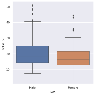
It captures the summary of the data efficiently with a simple box and whiskers and allows us to compare easily across groups.
- Boxplot summarizes a sample data using 25th, 50th and 75th percentiles.
These percentiles are also known as the lower quartile, median and upper quartile.
- A box plot consist of 5 things.
- Minimum
- First Quartile or 25%
- Median (Second Quartile) or 50%
- Third Quartile or 75%
- Maximum
Violin Plot
Let’s see the same thing with the help of violin plot which will help us to understand distribution too with help of it’s width.

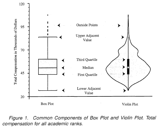
- It shows the distribution of quantitative data across several levels of one (or more) categorical variables such that those distributions can be compared.
- It is really close from a boxplot, but allows a deeper understanding of the
density.
- The density is mirrored and flipped over and the resulting shape is filled in,
creating an image resembling a violin.
- The advantage of a violin plot is that it can show nuances in the distribution
that aren’t perceptible in a boxplot.
- On the other hand, the boxplot more clearly shows the outliers in the data.
- Violins are particularly adapted when the amount of data is huge and showing
individual observations gets impossible.
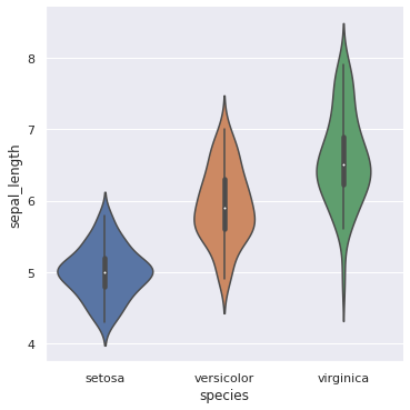
We’ll use a different dataset for same. We have dataset named iris which is a flower. We are having it’s sepal length and petal length on which we’ll work on.

In [ ]:
df = sns.load_dataset(‘iris’) df.head()
Out[ ]:
| sepal_length | sepal_width | petal_length | petal_width | species | |
|---|---|---|---|---|---|
| 0 | 5.1 | 3.5 | 1.4 | 0.2 | setosa |
| 1 | 4.9 | 3.0 | 1.4 | 0.2 | setosa |
| 2 | 4.7 | 3.2 | 1.3 | 0.2 | setosa |
| 3 | 4.6 | 3.1 | 1.5 | 0.2 | setosa |
| 4 | 5.0 | 3.6 | 1.4 | 0.2 | setosa |
In [ ]:
sns.catplot(x = ‘species’, y = ‘sepal_length’, data = df, kind = ‘violin’) plt.show() #The width explains us the maximum distribution at that point.
In [ ]:
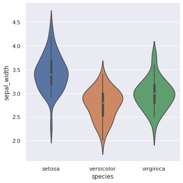
sns.catplot(x = ‘species’, y = ‘sepal_width’, data = df, kind = ‘violin’) plt.show()


hay