
- In the world of Analytics, the best way to get insights is by visualizing the data. We have already used Matplotlib, a 2D plotting library that allows us to plot different graphs and charts.
- Another complimentary package that is based on data visualization library is Seaborn, which provide a higher level interface to draw statistical graphics.
Seaborn
• Is a python data visualization library for statistical plotting
• Is based on matplotlib (built on top of matplotlib)
• Is designed to work with NumPy and pandas data structures
• Provides a high-level interface for drawing attractive and informative statistical graphics.
• Comes equipped with preset styles and color palettes so you can create complex, aesthetically pleasing charts with a few lines of code.
Seaborn vs Matplotlib
Seaborn is built on top of Python’s core visualization library matplotlib, but it’s meant to serve as a complement, not a replacement.
• In most cases, we’ll still use matplotlib for simple plotting
• On Seaborn’s official website, they state: “If matplotlib “tries to make easy things easy and hard things possible”, seaborn tries to make a well-defined set of hard things easy too.
- Seaborn helps resolve the two major problems faced by Matplotlib, the problems are −
 *      • Default Matplotlib parameters

 *      • Working with data frames
In [ ]:
# Let's see the difference between codes of matplotlib and Seaborn
In [ ]:
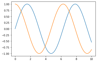
# Matplotlib
import matplotlib.pyplot as plt
import numpy as np
import pandas as pd

x = np.linspace(0, 10, 1000)
plt.plot(x, np.sin(x), x, np.cos(x));
plt.show()
In [ ]:
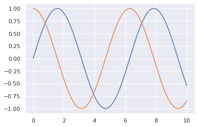
# Seaborn
import matplotlib.pyplot as plt
import numpy as np
import pandas as pd
import seaborn as sns

sns.set()

x = np.linspace(0, 10, 1000)
# print(x)
plt.plot(x, np.sin(x), x, np.cos(x));
plt.show()
Data visualization using Seaborn
- Visualizing statistical relationships
- Visualizing categorical data
Visualizing statistical relationships (This can be also defined as relationship between variables)
The process of understanding relationships between variables of a dataset and how these relationships, in turn, depend on other variables is known as statistical analysis
relplot()
• This is a figure-level-function that makes use of two other axes functions for Visualizing Statistical Relationships which are –
* scatterplot()

* lineplot()
- By default it plots scatterplot()
In [ ]:
import seaborn as sns
import pandas as pd
import matplotlib.pyplot as plt
sns.set()
In [ ]:
df = sns.load_dataset('tips')
df.head()
Out[ ]:
| total_bill | tip | sex | smoker | day | time | size | |
|---|---|---|---|---|---|---|---|
| 0 | 16.99 | 1.01 | Female | No | Sun | Dinner | 2 |
| 1 | 10.34 | 1.66 | Male | No | Sun | Dinner | 3 |
| 2 | 21.01 | 3.50 | Male | No | Sun | Dinner | 3 |
| 3 | 23.68 | 3.31 | Male | No | Sun | Dinner | 2 |
| 4 | 24.59 | 3.61 | Female | No | Sun | Dinner | 4 |
In [ ]:
df.tail()
Out[ ]:
| total_bill | tip | sex | smoker | day | time | size | |
|---|---|---|---|---|---|---|---|
| 239 | 29.03 | 5.92 | Male | No | Sat | Dinner | 3 |
| 240 | 27.18 | 2.00 | Female | Yes | Sat | Dinner | 2 |
| 241 | 22.67 | 2.00 | Male | Yes | Sat | Dinner | 2 |
| 242 | 17.82 | 1.75 | Male | No | Sat | Dinner | 2 |
| 243 | 18.78 | 3.00 | Female | No | Thur | Dinner | 2 |
In [ ]:
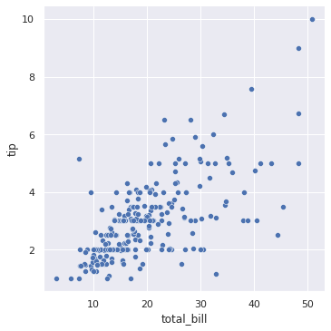
sns.relplot(x = 'total_bill', y = 'tip', data = df, kind = 'scatter')
plt.show() #that how there is direct relation between the food ordered and tip given.
In [ ]:
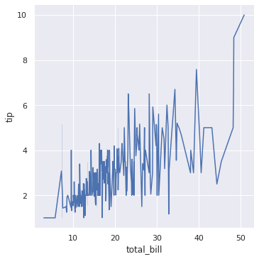
# We can also change kind to line.
sns.relplot(x = 'total_bill', y = 'tip', data = df, kind = 'line')
plt.show() #there is direct relation between the food ordered and tip given.
In [ ]:
# Parameters -
# • x, y
# • data
# • hue: It separtes the colour of dots with their types.
# • size
# • col: It can help to have different sex graphs.
# • style: They are used for showing differnt style of points.
In [ ]:
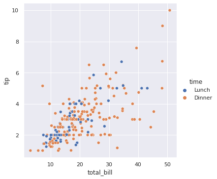
sns.relplot(x = 'total_bill', y = 'tip', data = df, hue = 'time')
plt.show() # By using hue we can see different time of lunch and dinner.
In [ ]:
sns.relplot(x = 'total_bill', y = 'tip', data = df, hue = 'time', style = 'sex')
plt.show() # By style we can see circle are male and x are female.
In [ ]:
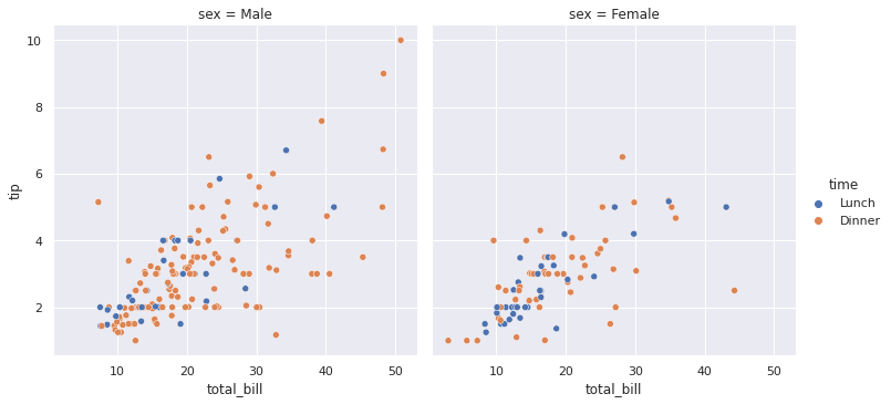
sns.relplot(x = 'total_bill', y = 'tip', data = df, hue = 'time', col='sex')
plt.show() # col generated two differenet graphs when sex is male or female.
Let’s do the same with lines.
In [ ]:
import seaborn as sns
import pandas as pd
import matplotlib.pyplot as plt
sns.set()
In [ ]:
print(sns.get_dataset_names())
['anagrams', 'anscombe', 'attention', 'brain_networks', 'car_crashes', 'diamonds', 'dots', 'exercise', 'flights', 'fmri', 'gammas', 'geyser', 'iris', 'mpg', 'penguins', 'planets', 'tips', 'titanic']
In [ ]:
df = sns.load_dataset('flights')
df.head()
Out[ ]:
| year | month | passengers | |
|---|---|---|---|
| 0 | 1949 | Jan | 112 |
| 1 | 1949 | Feb | 118 |
| 2 | 1949 | Mar | 132 |
| 3 | 1949 | Apr | 129 |
| 4 | 1949 | May | 121 |
In [ ]:
df.tail()
Out[ ]:
| year | month | passengers | |
|---|---|---|---|
| 139 | 1960 | Aug | 606 |
| 140 | 1960 | Sep | 508 |
| 141 | 1960 | Oct | 461 |
| 142 | 1960 | Nov | 390 |
| 143 | 1960 | Dec | 432 |
In [ ]:
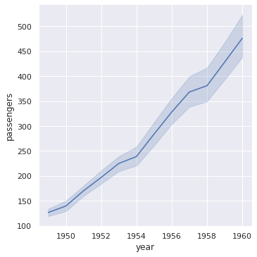
sns.relplot(x = 'year', y = 'passengers', data = df, kind = 'line')
plt.show() # So the dark blue line gives us exact average and rest of the shade tells us the diversity at that point.
In [ ]:
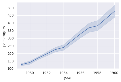
sns.lineplot(x = 'year', y = 'passengers', data = df)
plt.show()
In [ ]:
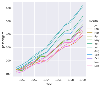
sns.relplot(x = 'year', y = 'passengers', data = df, kind = 'line', hue = 'month')
plt.show()
In [ ]:
sns.relplot(x = 'year', y = 'passengers', data = df, kind = 'line',
            col = 'month')
plt.show()
